
It’s in the name—Fitbit is for the absolute fitness fanatics or just about anyone determined to stay healthy. Because of this, the company’s lineup of fitness bands and smartwatches are beloved worldwide. So much so that Google’s parent company Alphabet Inc. announced its intention to acquire Fitbit. The acquisition, valued at a whopping $2.1 billion dollars, has been met with a major hurdle and as a result, the deal isn’t set in stone yet. But amidst all the acquisitional chaos, Fitbit has been active in launching a new lineup of smartwatches. Fitbit’s fall 2020 lineup also consisted of the Versa 3 that I have with me. The Versa 3 is a pretty sizable upgrade from its predecessor, but it does have a few troubles of its own. So let’s find out more about the Fitbit Versa 3 in this review.
Fitbit Versa 3 Specifications:
- Body: 1.59L x 1.59W x 0.49H-inches, 39.70 grams
- Band: (Small: 5.5 – 7.1″ wrist | Large: 7.1 – 8.7″ wrist)
- Display: 1.58 AMOLED, Always-on Display (AoD)
- Connectivity: Wi-Fi 802.11 b/g/n (2.4GHz), Bluetooth 5.0, GPS+GLONASS
- Audio: Microphone, Speaker
- Battery Backup: Up to 6 days
- Compatibility: iOS 12.2 or 12.2+ | Android 7.0 or 7.0+
- Companion App: Fitbit (Android | iOS)
- Water Resistant: 5ATM (up to 50m)
- Sensors: Red & infrared sensors for SpO2, 3-axis accelerometer, Altimeter, NFC, Optical heart rate, Device temperature, Ambient light
- Features: 24/7 heart rate tracking, sleep stages & sleep score, Active Zone Minutes, all-day activity tracking, 20 goal-based exercise modes, workout intensity map, sleep mode, guided breathing sessions, menstrual health tracking, etc.
- Colors: Black / Black Aluminum, Pink Clay / Soft Gold Aluminum, Midnight / Soft Gold Aluminum
- Price in Nepal: Rs. 39,999
Fitbit Versa 3 Review:
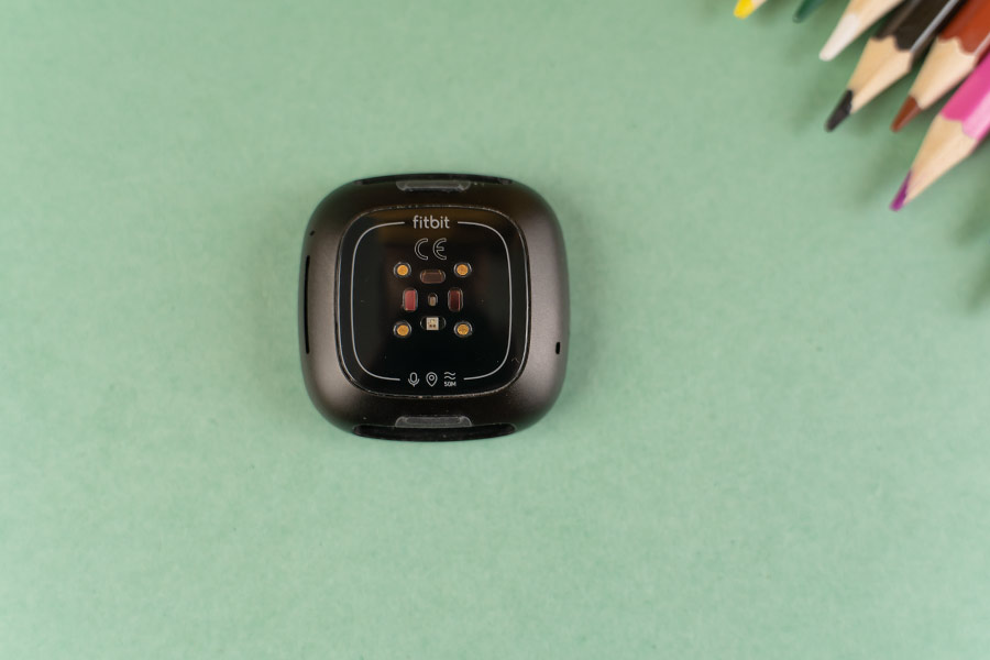
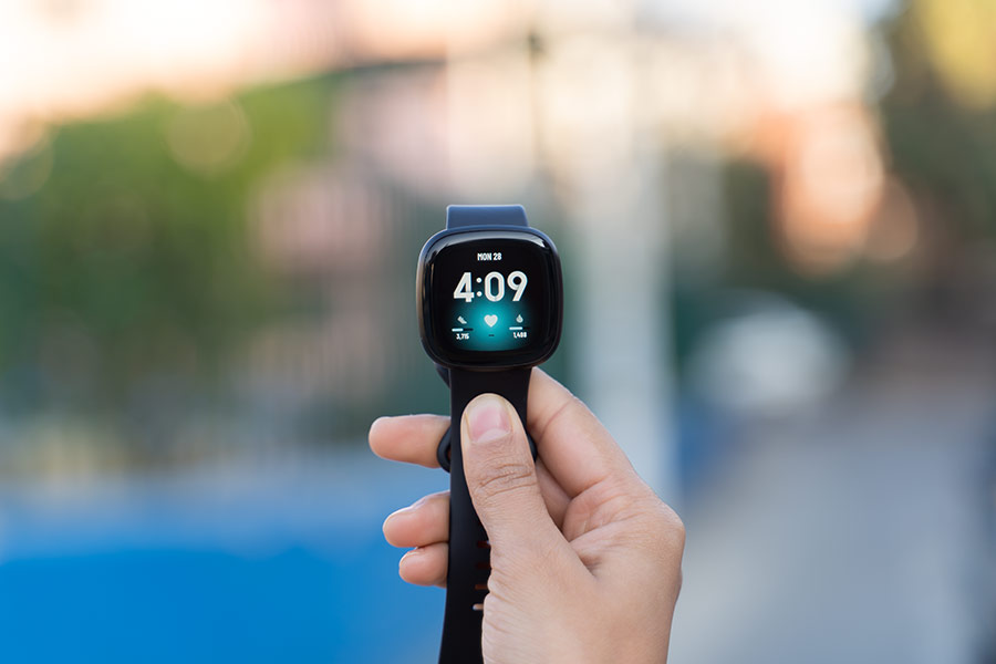
Design & Build
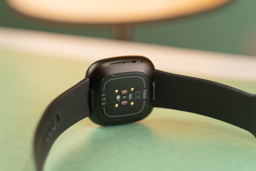
- Classic squircle body with aluminum case
- Comfortable, flexible strap | 5ATM certification
![Fitbit Versa 3 - Design [1]](https://cdn.gadgetbytenepal.com/wp-content/uploads/2020/12/Fitbit-Versa-3-Design-1.jpg)
To everyone’s delight, the company hasn’t made a drastic change in the design department in this rendition of a Versa smartwatch. Like the ones before it, the Versa 3 comes in a squircle form factor with an aluminum watch case and a flexible band. While the case is available in either Soft Gold or Black Aluminum finish, there’s a bunch of fashion-friendly options when it comes to the band.
- Meanwhile, checkout all the prices and specs of fitbit smartwatches
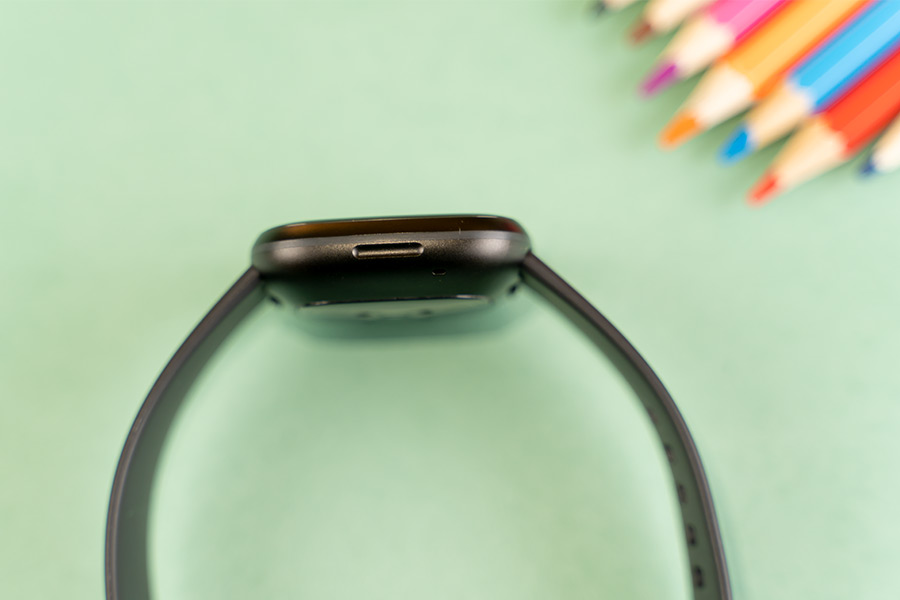
The default ones include black, pink, and midnight blue, whereas you can also opt for designer bands to match your style. Of course, the latter options come with an additional cost. Likewise, the Versa 3 also ships with an additional large wristband for optimum support. The pre-installed one fit me perfectly, so I didn’t bother with the large band. However, unlike me, if you need to switch ‘em up, it’s incredibly easy to do so.
Just gently push the little switch on the bottom of the watch and pull the band. It’s that simple. The same goes for the other end of the wristband. Anyway, these “Infinity Bands” (as Fitbit calls them) are very comfortable in the hand. Its soft nature paired with the lightweight quality of the watch itself meant I had absolutely zero issues putting it on for a prolonged duration. Neither did I develop skin irritation or allergies of any kind.
Comfortable fit
Despite the stellar feel and fit, be sure to not wear it every waking moment of your life. As Z puts it, “you gotta take ‘em off every now and then—you gotta take ’em off, son”. This is to absolutely steer clear of the aforementioned skin complications, which Fitbit itself suggests. That in itself is pretty vague advice but despite this, throughout my usage, I never put them off—except when charging. Moving on, Versa 3 is also 5ATM water-resistant. With this, you can also take the smartwatch to the pool and track your swimming stats. Talking about durability, my unit of the watch is in pretty tip-top shape but I wouldn’t be surprised to find that it would give up quite easily upon a significant impact/fall.
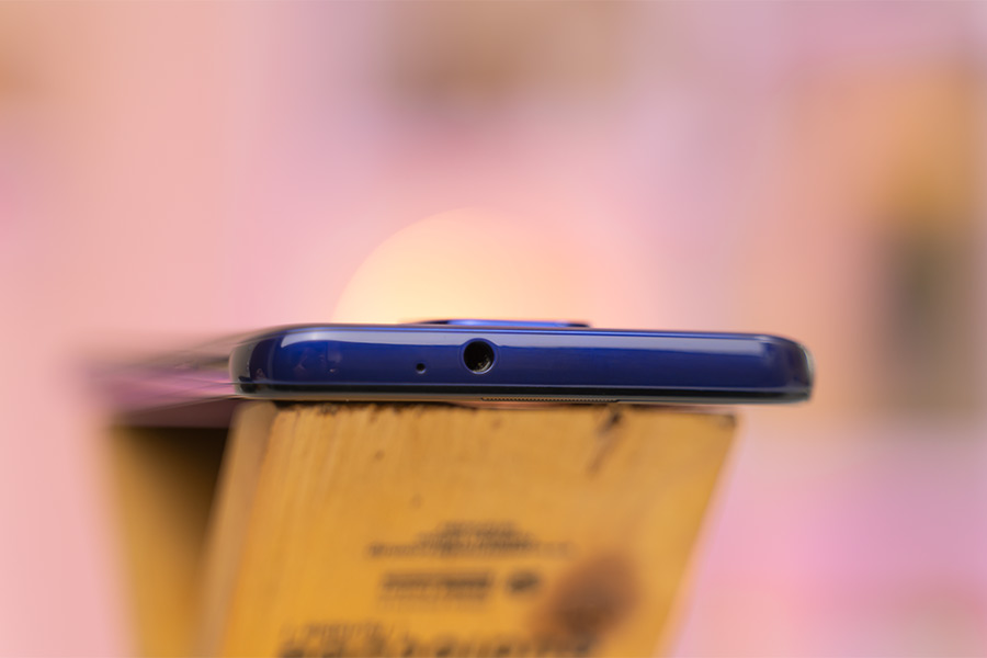
Here, the right frame of Versa 3 features a microphone and a speaker. Similarly, on the left is a stupid, stupid inductive button with haptic feedback for navigation. More on that in just a minute. All in all, the Fitbit Versa 3 is a pretty well-built smartwatch with a clever mechanism to swap the wristband.
Display
- 1.58″ AMOLED panel, AoD
- 10,000+ watch faces
On the display side of things, the screen real-estate in this year’s Versa has been enlarged by a lot. While the Versa 2 came with a 1.4-inch AMOLED panel, its successor now has a bigger 1.58-inch screen. Consequently, the pixel count has increased too. With a 336×336 resolution, texts, icons, and animations look crisp on this screen. As expected from an AMOLED display, you can also enjoy Always-on Display here.
But since the climate demands sleeved clothing, I turned it off altogether. Plus, the resulting extension to battery endurance is also something I’d rather have. Additionally, Versa 3 can get pretty bright as well—therefore, I didn’t face an issue looking at it even under direct sunlight. You can choose from three levels of illumination: dim, normal, and max.
Also, the screen has a gentle curve for enhanced navigation and swipes. Regardless, I would’ve preferred if Fitbit had gone for thinner bezels. Not only would it enhance the visual aesthetics, that would also result in a lighter body. But to be clear, I don’t mean to say the Versa 3 is uncomfortable to wear in its current state—absolutely not.
10K+ watch faces
Furthermore, the rise to wake up the screen feature works perfectly fine. You can also opt to exclusively turn on the display via the button, but I strayed away from it entirely. When it comes to watch-faces, the Fitbit app boasts over 10,000 of them including paid and free ones. Unfortunately, you can only store a maximum of 5 watch faces in your gallery at a time. Switching between them is fairly easy.
![Versa 3 - Clock Faces [2]](https://cdn.gadgetbytenepal.com/wp-content/uploads/2020/12/Versa-3-Clock-Faces-2.jpg)
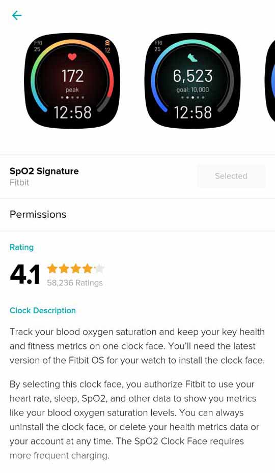
Just use the companion smartphone app, or through the “Clocks” app on the watch. This feels like such a limiting experience for what is otherwise a premium smartwatch. But it doesn’t end there. While Versa 3 supports blood oxygen monitoring, it limits you to view your SpO2 data on a single watch face called “SpO2 Signature”.
You can view the nightly SpO2, resting heart rate (RHR) data under the “Health Metrics” tap inside the Fitbit app. There are pretty well-designed watch faces inside the Fitbit app, to be honest. Yet, because of this issue, I had to constantly make a trade-off between my desired watch face, and one that’s capable of showcasing my SpO2 stats.
Performance, Fitbit OS
- Unnamed processor, Fitbit OS
- Google Assistant, Amazon Alexa support
Getting into performance, let’s start with setup, shall we? Versa 3 first requires you to download the Fitbit app. You then need to sign-up or log-in to an existing Fitbit account. After this, select Versa 3 from the list of available options and once the watch connects with your phone, it displays a 4-digit code that you need to type into the app. With successful pairing accomplished, the rest of the setup includes download and installing updates (if any) and setting up the WiFi on the Versa 3. This entire process is rather quite slow and in my case, it took me about 15 minutes to complete.
![Fitbit App - Dashboard [1]](https://cdn.gadgetbytenepal.com/wp-content/uploads/2020/12/Fitbit-App-Dashboard-1.jpg)
![Fitbit App - Dashboard [2]](https://cdn.gadgetbytenepal.com/wp-content/uploads/2020/12/Fitbit-App-Dashboard-2.jpg)


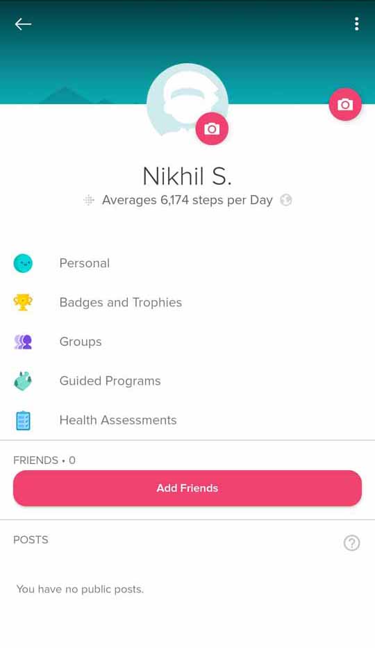

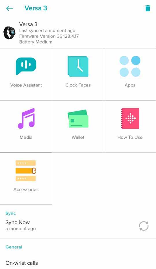
Powering this smartwatch is an unnamed processor. Similarly, it runs on the proprietary Fitbit OS. At the time of writing this review, my unit of the Fitbit Versa 3 runs on firmware version 36.128.4.17. For what it’s worth, it is a fairly well-designed OS. This is my first Fitbit gadget therefore I didn’t exactly have a point of reference about what to expect. While I was expecting things to be fluent and smooth all-around, the Versa 3 let me down marginally.
Faltering UI/UX
Let’s start with the UI. The home screen consists of the selected watch face, while the control panel resides on the left. It’s not customizable and you’re stuck with what Fitbit’s offering. Here, you can toggle do-not-disturb mode, AoD, brightness controls, and more. Likewise, the widgets can be accessed by swiping up from the bottom. Unlike the control center, you do have the option to select which ones to show (their selection is pretty limited though). On the other hand, all the installed apps are designated to the right space, and you can swipe through them.
The transition between the menus is quite stuttery. I’m not sure if this is something that can be fixed with a firmware update, so I blame the incompetent processor or the under-optimized software for this lackluster UI/UX experience. Finally, all the notifications are arranged on the top. Pairing it with an Android smartphone, one can also quickly send a reply to texts. While it doesn’t let you type up your response, the alternatives include voice-to-text, emoji, and quick replies. Interestingly, Versa 3 also latches an “Undo” option to your replies.
One could argue that this is compensation for the inherently slow processing power of the smartwatch, but I for one welcome it with open arms. To be clear, this is not something like the “Unsend” feature on Facebook Messenger. Rather, the “undo” refers to skip the delivery of the message altogether. Using the Fitbit app lets you select which apps deliver notifications on the watch, and even set custom quick replies.
Removing “voice” from Voice Assistant
Moving on, Fitbit Versa 3 is also fortified with voice assistant—two of them. You can choose to get your questions replied to by Google Assistant or Amazon Alexa. I went with the former, and I must say, the voice recognition on this thing works pretty darn fine. However, you can’t trigger it willy-nilly using your voice, no sir. I was quite shocked to find the lack of “Ok Google” or “Hey Google” integration. So, you will have to open the Assistant app for your queries.
But hold your horses. An even bigger surprise lies in the fact that the digital assistant doesn’t support audio response. Despite featuring a decent speaker, I just don’t understand this limitation. In addition, the app selection in Fitbit OS isn’t the widest either. For me, the absence of Google Maps was the biggest bummer and I made do with Maps by here. It also supports streaming services like Spotify, Pandora, and Deezer.
![Versa 3 - App Store [1]](https://cdn.gadgetbytenepal.com/wp-content/uploads/2020/12/Versa-3-App-Store-1.jpg)
![Versa 3 - App Store [2]](https://cdn.gadgetbytenepal.com/wp-content/uploads/2020/12/Versa-3-App-Store-2.jpg)
Weirdly enough, it can’t integrate your Spotify account if you’re a free subscriber. And even if you have a premium Spotify account, there is no offline streaming support. Versa 3’s product page does mention you can locally store your music & podcasts from Deezer and Pandora onto the smartwatch but since I don’t have a subscription to either platform, I couldn’t try it out.
Decent call quality
Like I mentioned earlier, the Fitbit Versa 3 also equips a microphone and a speaker, therefore making voice calls possible. While you can’t make phone calls directly from the watch, you can choose to decline or accept them. The call quality itself is alright when you’re in a relatively silent environment.
Yet, I would strictly advise against phone calls in a rather rowdy ambiance since you’ll have a hard time keeping up with the conversation. Also, there is no VoIP call support of any sort. If you fail to pick up the call, you’ll receive a notification but that’s about it. Additionally, Versa 3 features NFC connectivity using which you can make contactless payments and such.
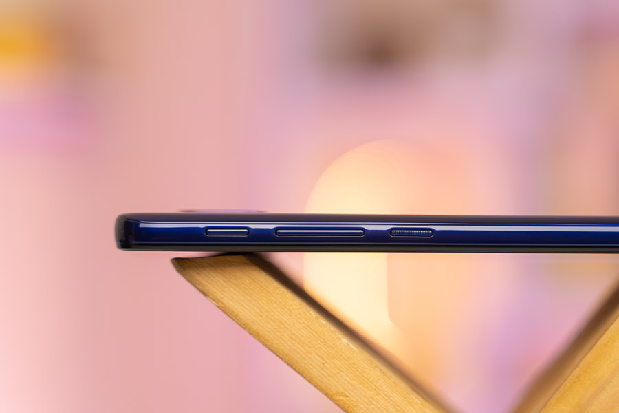
A button implementation so dense that light bends around it
Okay, now let’s talk about the inductive button on the side. Fitbit has borrowed this haptic-enabled button from the Charge 3 fitness band. I can’t stress enough how frustrating this button is. It requires you to press on the indent with a notable amount of pressure otherwise it just doesn’t work. Moreover, because it’s located on the left frame, accessing it while having the watch on your left hand becomes an unnecessary hassle.
Sacrificing comfort to aesthetics is always a big no in my books. And it doesn’t double as a back button either. For that, you’re gonna have to swipe to the right. It can be used to wake the screen or go to the home screen. Plus, you can also assign shortcuts upon a long or double press.
Health, Fitness, Sleep Tracking
- 20 goal-based exercises, periodic reminders
- Automatic Exercise Recognition (customizable)
- Built-in GPS, Nightly SpO2 monitoring
- Certain features restricted behind a paywall
Getting to the fitness tracking properties of the Versa 3, suffice to say, it does more than a good job. Fitted with a bunch of different sensors, it can track a wide range of health, fitness, and sports attributes. To start things off, there are altogether 20 goal-based exercises including golf, hike, pilates, walk, yoga, etc.
![Versa 3 - Weekly Steps [2]](https://cdn.gadgetbytenepal.com/wp-content/uploads/2020/12/Versa-3-Weekly-Steps-2.jpg)
![Versa 3 - Weekly Steps [1]](https://cdn.gadgetbytenepal.com/wp-content/uploads/2020/12/Versa-3-Weekly-Steps-1.jpg)
![Versa 3 - Weekly Calories [2]](https://cdn.gadgetbytenepal.com/wp-content/uploads/2020/12/Versa-3-Weekly-Calories-2.jpg)
![Versa 3 - Weekly Calories [1]](https://cdn.gadgetbytenepal.com/wp-content/uploads/2020/12/Versa-3-Weekly-Calories-1.jpg)
![Versa 3 - Weekly Floors [2]](https://cdn.gadgetbytenepal.com/wp-content/uploads/2020/12/Versa-3-Weekly-Floors-2.jpg)
![Versa 3 - Weekly Floors [1]](https://cdn.gadgetbytenepal.com/wp-content/uploads/2020/12/Versa-3-Weekly-Floors-1.jpg)
It automatically tracks your daily steps, heart rate, and a few other activities. Furthermore, the menstrual health tracking ability lets you track ovulation, discover patterns, log periods, and more on this smartwatch.
Here, Fitbit Versa 3 comes with PurePulse 2.0 technology complementing the optical heart rate sensor. What’s more, thanks to SmartTrack, it can also automatically record and track different exercises like walking, running, swimming, outdoor bike, etc.
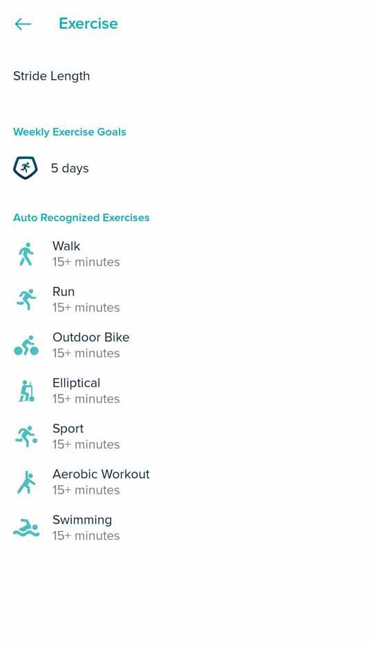
By default, this tracks your activity after you’ve been active for 15 minutes or more. However, using the Fitbit app, you can set a custom value, or disable automatic tracking of a particular exercise altogether.
Active Zone Minutes (AZM)
There’s also something called “Active Zone Minutes”. Introduced in Fitbit Charge 4, it is geared towards keeping your heart healthier. Depending on what heart-pumping exercise you indulge in, you are awarded varying points. For instance, for simple, slow-paced walks where your heart-rate stays within 120-144 BPM (fat burn zone), you earn 1 zone minute. On the other hand, under exercises where your heart rate climbs 145-176, you enter the cardio zone while 177 or higher BPM falls under the peak zone. Under both of these, you earn 2 zone minutes.
![Versa 3 - AZM [1]](https://cdn.gadgetbytenepal.com/wp-content/uploads/2020/12/Versa-3-AZM-1.jpg)
![Versa 3 - AZM [2]](https://cdn.gadgetbytenepal.com/wp-content/uploads/2020/12/Versa-3-AZM-2.jpg)
![Versa 3 - AZM [3]](https://cdn.gadgetbytenepal.com/wp-content/uploads/2020/12/Versa-3-AZM-3.jpg)
![Versa 3 - AZM [4]](https://cdn.gadgetbytenepal.com/wp-content/uploads/2020/12/Versa-3-AZM-4.jpg)
![Versa 3 - AZM [5]](https://cdn.gadgetbytenepal.com/wp-content/uploads/2020/12/Versa-3-AZM-5.jpg)
![Versa 3 - AZM [6]](https://cdn.gadgetbytenepal.com/wp-content/uploads/2020/12/Versa-3-AZM-6.jpg)
World Health Organization (WHO) recommends you partake in 150 minutes of moderate, or 75 minutes of vigorous activity. And I must say, out of everything else, Versa 3’s AZM really motivated me to get daily exercises in order to reach my weekly goal of 150 active zone minutes. And being able to track all the data in the Fitbit app meant I was always informed about my exercises to a degree I wasn’t before.
![Versa 3 - Hourly Activity [1]](https://cdn.gadgetbytenepal.com/wp-content/uploads/2020/12/Versa-3-Hourly-Activity-1.jpg)
![Versa 3 - Hourly Activity [2]](https://cdn.gadgetbytenepal.com/wp-content/uploads/2020/12/Versa-3-Hourly-Activity-2.jpg)
![Versa 3 - Hourly Activity [3]](https://cdn.gadgetbytenepal.com/wp-content/uploads/2020/12/Versa-3-Hourly-Activity-3.jpg)
Well-designed companion app
Everything is so well organized and easy to understand in the app—kudos to the development team for this feat. To further motivate to get you moving, it also hourly alerts you to take a walk. I’m also quite fond of the brief stress-relieving sessions.
![Versa 3 - Mindfulness [1]](https://cdn.gadgetbytenepal.com/wp-content/uploads/2020/12/Versa-3-Mindfulness-1.jpg)
![Versa 3 - Mindfulness [2]](https://cdn.gadgetbytenepal.com/wp-content/uploads/2020/12/Versa-3-Mindfulness-2.jpg)
Under the “Mindfulness” menu, there are multiple meditational, relaxing sessions—some free, some paid. Each session tracks your heart rate and at the end, you can tag your progress for a better assessment. On top of that, Versa 3’s guided breathing sessions help you stay zen too. There are also a couple of manual tracking options like water and food intake.
Built-in GPS
One of the biggest upgrades compared to its previous iteration is the built-in GPS. Still, the location tracking was a bit of a let-down for me.
![Versa 3 - Exercise [1]](https://cdn.gadgetbytenepal.com/wp-content/uploads/2020/12/Versa-3-Exercise-1.jpg)
![Versa 3 - Exercise [2]](https://cdn.gadgetbytenepal.com/wp-content/uploads/2020/12/Versa-3-Exercise-2.jpg)
![Versa 3 - Exercise [3]](https://cdn.gadgetbytenepal.com/wp-content/uploads/2020/12/Versa-3-Exercise-3.jpg)
![Versa 3 - Exercise [4]](https://cdn.gadgetbytenepal.com/wp-content/uploads/2020/12/Versa-3-Exercise-4.jpg)
![Versa 3 - Exercise [5]](https://cdn.gadgetbytenepal.com/wp-content/uploads/2020/12/Versa-3-Exercise-5.jpg)
![Versa 3 - GPS [1]](https://cdn.gadgetbytenepal.com/wp-content/uploads/2020/12/Versa-3-GPS-1.jpg)
![Versa 3 - GPS [2]](https://cdn.gadgetbytenepal.com/wp-content/uploads/2020/12/Versa-3-GPS-2.jpg)
![Versa 3 - GPS [3]](https://cdn.gadgetbytenepal.com/wp-content/uploads/2020/12/Versa-3-GPS-3.jpg)
Whenever I started any exercise, the GPS lock isn’t instantaneous. And at times, it disconnects mid exercise or fails to get the signal entirely. As a result, a couple of my exercises have been locked incorrectly.
Remember how I complained about SpO2 stats being exclusive to one watch face, well there’s so much more to say about Fitbit Versa 3’s blood oxygen monitoring. First, installing the watch face itself was a tricky journey. Apparently, it’s not available in every region—with Nepal being one of them.
![Versa 3 - Clock Faces [1]](https://cdn.gadgetbytenepal.com/wp-content/uploads/2020/12/Versa-3-Clock-Faces-1.jpg)
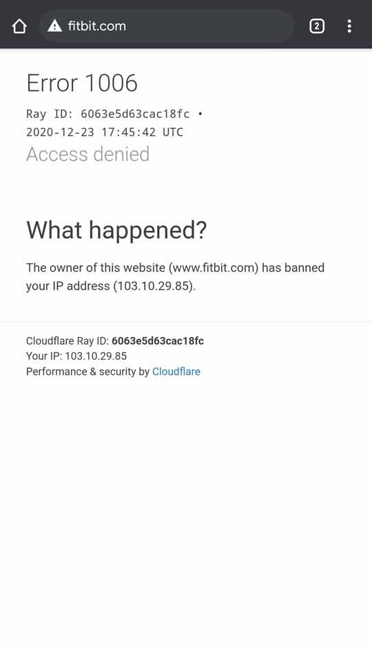
So, I tried using a VPN and connected to a UK server. With this, I was able to download the said watch face. Hurray, I thought to myself! But what I hadn’t realized by this time was that by doing this, Fitbit had now blocked my home IP address.
I hurriedly Googled for a fix and clicked on the first link that popped up—only to face Error 1006: Access denied. Silly me, I tried to access the Fitbit community website from an IP address that I just got blocked from. Here on after, I had to turn on the VPN every time I have to sync the Versa 3 with my smartphone. Feels like I committed some sort of cyber-crime, lol. Thankfully, on the fourth day, things went back to normal.
Sleep Monitoring
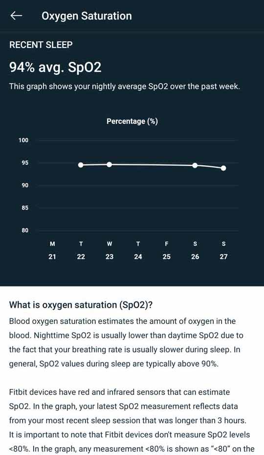
Besides this, Versa 3 can only record SpO2 levels at night when you’re sleeping. So, unlike say the Galaxy Watch3 which can measure your SpO2 level anytime you’d want, that’s not possible here. However, I think this restriction shines in terms of sleep monitoring. Based on your blood oxygen saturation throughout the night, it can alert you of possible breathing issues too.
![Versa 3 - Sleep Monitoring [1]](https://cdn.gadgetbytenepal.com/wp-content/uploads/2020/12/Versa-3-Sleep-Monitoring-1.jpg)
![Versa 3 - Sleep Monitoring [2]](https://cdn.gadgetbytenepal.com/wp-content/uploads/2020/12/Versa-3-Sleep-Monitoring-2.jpg)
![Versa 3 - Sleep Monitoring [3]](https://cdn.gadgetbytenepal.com/wp-content/uploads/2020/12/Versa-3-Sleep-Monitoring-3.jpg)

![Versa 3 - Sleep Monitoring [4]](https://cdn.gadgetbytenepal.com/wp-content/uploads/2020/12/Versa-3-Sleep-Monitoring-4.jpg)
![Versa 3 - Sleep Monitoring [5]](https://cdn.gadgetbytenepal.com/wp-content/uploads/2020/12/Versa-3-Sleep-Monitoring-5.jpg)
![Versa 3 - Sleep Monitoring [6]](https://cdn.gadgetbytenepal.com/wp-content/uploads/2020/12/Versa-3-Sleep-Monitoring-6.jpg)
![Versa 3 - Sleep Monitoring [7]](https://cdn.gadgetbytenepal.com/wp-content/uploads/2020/12/Versa-3-Sleep-Monitoring-7.jpg)
![Versa 3 - Sleep Monitoring [8]](https://cdn.gadgetbytenepal.com/wp-content/uploads/2020/12/Versa-3-Sleep-Monitoring-8.jpg)
Talking about core sleep monitoring itself, I found that the watch accurately logged my time to bed and the time I got up. Like most other premium smartwatches, Fitbit Versa 3 also scores your sleep from 0-100.
Paywall restriction
Some users (especially ones who are already knee-deep into the Fitbit ecosystem) may disagree with me here but I find the paywall restriction incredibly annoying. Buying a premium piece of hardware only to find its possibilities limited by a subscription service makes me feel like I don’t own the watch—and rather I’m just renting it. You do get 90-days of free trial but then, it costs $9.99 every month (or $79.99 annually) for Fitbit Premium.
![Versa 3 - Walk Exercise [1]](https://cdn.gadgetbytenepal.com/wp-content/uploads/2020/12/Versa-3-Walk-Exercise-1.jpg)
![Versa 3 - Walk Exercise [2]](https://cdn.gadgetbytenepal.com/wp-content/uploads/2020/12/Versa-3-Walk-Exercise-2.jpg)
![Versa 3 - Walk Exercise [3]](https://cdn.gadgetbytenepal.com/wp-content/uploads/2020/12/Versa-3-Walk-Exercise-3.jpg)
![Versa 3 - Walk Exercise [4]](https://cdn.gadgetbytenepal.com/wp-content/uploads/2020/12/Versa-3-Walk-Exercise-4.jpg)
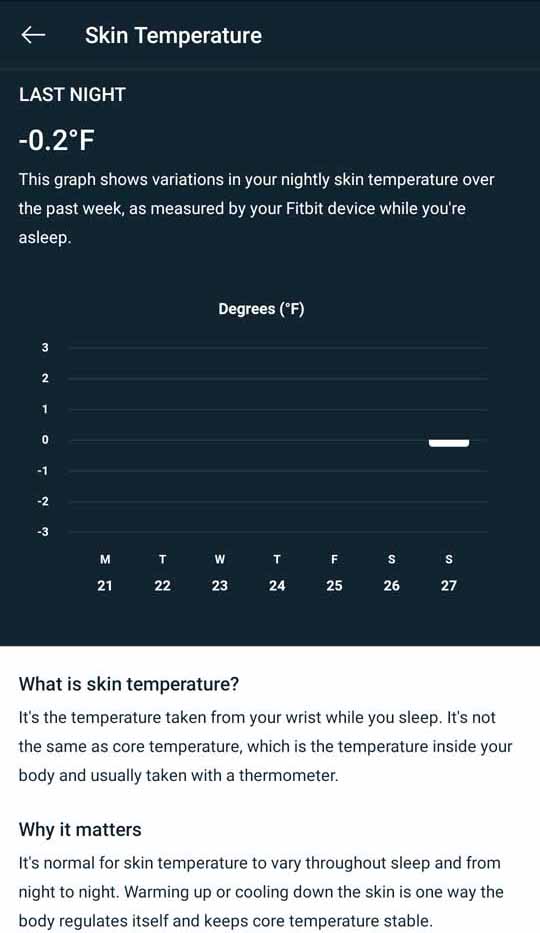
Granted you can’t put a price on your health and there are some impressive benefits from this service, I feel like the asking price is way too much and I for one am not willing to pay that much. I was so eager to learn about Versa 3’s skin temperature variation reading, only to find out it’s behind the paywall. Nightly data is free for all, but for real-time skin-temperature reading like on the premium Fitbit Sense, you’re gonna have to subscribe to the premium service. Other restrictions to non… paying (?) users include a 30-day SpO2 trend, various guided meditations, etc.
Battery Life
- Exact battery size unspecified
- Up to 6 days of endurance (claimed)
Finally, let’s get into the battery life. Fitbit doesn’t specify the exact battery capacity but says you’re good for up to 6 days under normal usage. And that pretty much corroborated with my usage. With brightness set to normal, AoD turned off, and occasionally turning on the GPS (about 3 times), I almost managed to net out 6 days of endurance. This usage also consists of 24-hour heart rate monitoring and nightly SpO2 tracking. As you’d imagine, the number drastically falls when continuously turning on location tracking.
![Fitbit Versa 3 - Design [2]](https://cdn.gadgetbytenepal.com/wp-content/uploads/2020/12/Fitbit-Versa-3-Design-2.jpg)
For a full-fledged smartwatch, you really can’t complain about Fitbit Versa 3’s battery life. When it comes to juicing up the battery, it also supports fast charging. According to the company, you can get a day’s power with just 12 minutes of charge. I didn’t particularly test this out since I was more interested in its performance under 100% battery. Throughout my charging cycles, I recorded that it takes somewhere between 1 hour 7 minutes – 1 hour 15 minutes to get the battery from nil to full.
Conclusion
Time to wrap it all up. Fitbit Versa 3 fits the tagline of fitness supreme. From its wide selection of health, fitness, and sports tracking to other enticing smartwatch-first features, it delivers a pretty convincing wearable experience—but not without a few problems of its own though. The UI/UX itself is rather slow and the app library in Fitbit OS is pretty limited as well. I was particularly disappointed with its GPS tracking and the dreaded paywall restriction. Other than these, the Versa 3 is a solid smartwatch that offers a stellar battery life too.
- Watch our video review of Fitbit Versa 3.
Fitbit Versa 3 Review: Pros & Cons
Pros:
- Great design, comfortable straps
- Vibrant, bright AMOLED screen with AoD
- Google Assistant, Amazon Alexa support
- Decent microphone quality for phone calls
- Terrific health, fitness tracking features
- Excellent battery life for a smartwatch
Cons:
- Some feature only for premium users
- Performance, UI is a little stuttery
- App selection, Fitbit OS is limiting
- No audio response from voice assistant(s)
- The inductive button is downright stupid


![Vivo V20 SE - UI [2]](https://cdn.gadgetbytenepal.com/wp-content/uploads/2020/12/Vivo-V20-SE-UI-2.jpg)


 update to select phones")